

Toronto Cupcakes
The website for Toronto Cupcakes, a local cupcake shop in Toronto, is in need of a redesign. By improving the UI and information architecture of the website, we can increase the order of cupcakes as users experience an efficient checkout process with tasty imagery.

About the Project
The Problem
In its current state, the Toronto Cupcake website is causing users to second guess the professionalism and quality of cupcakes they provide.
The Solution
By designing a website with strong visuals, a clear brand identity, and intentional information architecture, we will provide users with an experience that allows them to easily view and purchase cupcakes while increasing their overall experience with the Toronto Cupcake website.
The Team and My Roles
The team consisted of four UX/UI Designers from the UX/UI Bootcamp through The George Washington University. For the project, I primarily acted as a Project Manager, UX Researcher, and Front End Developer. I also participated in wire-framing.
Tools Used


User Research
Heuristic Evaluation
We started by conducting a heuristic evaluation of the current site.
Problems we noticed:
Unclear navigation
No easy access to the shopping cart
Large white space in the footer
Unable to easily get to home page
Cupcake pictures different heights
Text overlapping with shadows, making it difficult to read

Quick navigation through the original website
Research Goals
We hypothesized that the UI on the Toronto Cupcakes site needed to be addressed. We also wanted to pinpoint user pain points when navigating the Toronto Cupcake website What types of things do our users expect to see and do if they visited a cupcake bakery website?
Research Plan
Usability Tests
Five usability test on the current Toronto Cupcake website
Survey
Survey participants from the general public about their expectations when visiting a bakery website.
Stakeholder Interview
A 1:1 interview with the original designer of the current website
Usability Tests
We had five users take a look at the current site for Toronto Cupcakes, giving them a task of ordering a dozen cupcakes. We wanted to know what pain points they were feeling during the checkout process, as well get their first impression on the business from the UI of the website.
Our key takeaways were:
The information architecture needed an overhaul, as users were struggling to navigate the site
The brand identity needed improvement via a clean, clear user interface with a professional appearance
The images throughout the site, especially the cupcakes, needed to be of a higher quality

Feedback from Usability Tests
Survey
We sent a survey out and had 20 Participants from 18-45 years old and found most participants are buying cupcakes as a special treat for themself or a gift for a special occasion. Other key findings were:
1.
70% have never ordered a cupcake/dessert online before
3.
Although 70% of our surveyors never ordered a cupcake/ dessert online, about 50% of them were open to using a dessert site to order for delivery or pickup.
2.
65% of people prefer buying a variety of cupcake flavors in an order
4.
50% would visit to see cupcake selection before visiting the shop, combined, 50% would visit to order for pick up or delivery
Stakeholder Interview
We were able to talk to Michael Mancuso, the Head Web Designer for Toronto Cupcakes. The conversation was eye-opening, as we learned background information on why the site was designed the way it was. Mainly, the owners of Toronto Cupcake chose to invest in quality ingredients and bakers rather than a storefront or website, wanting a low-maintenance eCommerce page. Mancuso made many design choices based on SEO.
At the time, Toronto Cupcakes did not have a storefront, so all sales were made through the website. This surprised us because we figured a company making sales through their website would try to focus on making the site easy and enticing. Since they do not advertise much, customers find them through word of mouth, which explains their heavy emphasis on quality cupcakes.

Outdated SEO practices on the original site
Definition & Synthesis
Problem Statement
The site currently fails to grab the attention of users in an effective way fostering an eCommerce process that is redundant and tiring. How might we improve the visual aesthetic and shopping experience on the Toronto Cupcake website so that our customers are able to successfully order cupcakes in an easy and intuitive way?
User Persona
With our findings, we created a user persona to help us understand what a customer for Toronto Cupcakes would expect when ordering cupcakes from them online.

Our users expect:
A clean and intuitive interface
Easy to locate contact, delivery or pick-up information
Reviews & recommendations
High quality visuals of the cupcakes available for purchase
Ideation
Feature Prioritization
Using insights from the usability tests, survey, and stakeholder interview, we created a feature prioritization matrix to determine what to prioritize that will benefit both the users and Toronto Cupcakes the most.

Feature Prioritization Matrix
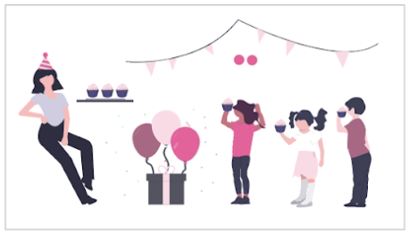
Story Board
Thinking of our user, we drafted up a story board, mapping out a situation where they are in need of cupcakes for party, showing that our redesign will be more successful in creating business as users will have an easier, enjoyable experience when ordering their treats.

Prototyping & Testing
Low Fidelity Wireframes
We individually set out to sketch wireframes for a new Home Page, coming back together to see how each other tackled different features we wanted present. We could then cooperatively combine ideas we found best from each to create the best design.

Wireframe Sketches
User Testing
With our prototype, we had users search for the delivery instruction and walk through the process of ordering a dozen cupcakes since we wanted to make sure it was intuitive for users. We found that it was important to include delivery information prominent on the front page, so users did not have to hunt for it.

Changes of the Home Page after testing
For purchasing cupcakes, we had a pop up where users could change the quantity of cupcakes they wish to add to cart. In our first design, we had included the different price options for the possibility of ordering a single cupcake versus a half dozen or dozen, and we found users were clicking on that text in order to make it so they were ordering that quantity. We decided to make those options buttons so users could easily select they wanted to order a half dozen or dozen.

Changes in the Product Popup
In the original design, users could not easily visit their shopping cart, being directed to a separate page. We wanted to make it easy for users to see their cart during the shopping process by having it drop down. This way the cart could be accessed during shopping without directing users to a separate page.

Changes in the Product Popup
Conclusion
Final Design
We achieved what we set out to do, which was to improve the UI and navigation of the Toronto Cupcakes website, so users had a more enjoyable experience when ordering cupcakes.
Thoughts
The biggest challenge in this project was finding images for the products. We had to work with the cupcakes on the original site which were taken in poor lighting, which had users struggling to be enticed in buying the cupcakes on the pictures alone.
Moving forward, we think it would be beneficial to focus on these areas that we did not get to tackle during the time of the assignment:
Look into how to incorporate reviews and recommendations from a third party (i.e. Yelp, Facebook)
Make mobile friendly
Focus on corporate client persona